Summary:
Several "no good" signs get worse, better wait until dust clears.
Expect at least a short-term pullback, may not start on Monday though.
| Trend | Momentum | Comments - Sample for using the trend table. | |
| Long-term | Down | Idea for trading intermediate-term under primary down trend. | |
| Intermediate | Up | Overbought* | |
| Short-term | Up | Neutral |
Two unusual events Friday:
1. 3.0.0 10Y T-Bill Yield, TNX breakout on the upside. This means a higher borrowing cost which is not good for the economic recovery.
2. 3.1.0 PowerShares DB US Dollar Index Bullish Fund (UUP Daily), rebound sharply. Not only this means a pullback in commodity price but also a possible start of a flight to safety.
We need watch carefully for those 2 events, if keeps going on, then I really doubt if there’s much upside room left for the stock market.
Short-term, I expect a pullback soon, just not sure if it will start on Monday.
1.0.3 S&P 500 SPDRs (SPY 30 min), too many negative divergences.
1.1.5 PowerShares QQQ Trust (QQQQ 30 min), Bearish Rising Wedge plus lots of negative divergence.
5.0.2 S&P Sector Bullish Percent Index, overbought again. The last time this overbought was at the beginning for the May and we all know that the market went nowhere the entire May.
2.3.4 Nasdaq Total Volume/NYSE Total Volume, a little bit too high which means a little extreme in chasing risky assets.
Reasons for not sure if the pullback starts Monday:
7.0.7 SPX and VIX Divergence Watch, when both SPX and VIX were down on the same day the next day mostly was an up day recently.
3.1.1 PowerShares DB US Dollar Index Bullish Fund (UUP 30 min), US$ is way overbought, could pullback on Monday and this is good for the stock market.
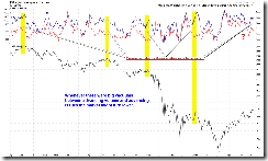
The conclusion is, well, no need to feel “missing the train AGAIN”, if we do have an up Monday. It’s not the time to be greedy as market may very close to a turning point. The following chart should bring your attention:


Excellent analysis again Cobra. I look forward to reading it every day.
ReplyDeleteCopra, thanks
ReplyDeleteI follow the Dllar index mostly and I have a good chart you may want to see but I don't know how to send or show it to you (because I am not that very good in using internet )
KaKa2009
KaKa2009, if you're using stockcharts you can either click send link under your chart and send to peter_y_pan@hotmail.com, or you can click linkable version link and paste the URL here.
ReplyDeleteCheers!
thanks for the charts. The last one was the most interesting to me..
ReplyDeleteWhat does the last chart above show?
ReplyDeleteIt also looks like when the top indicators come together a bottom is around the corner...
Yes, mr rolfsson, when they separate apart a top is around the corner...
ReplyDeletePersonally, looking at that last chart (which is awesome IMO), it didn't really help much to pick IT bottoms during the decline.
ReplyDeleteBut it does a great job picking IT tops!