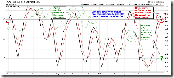
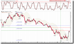
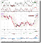
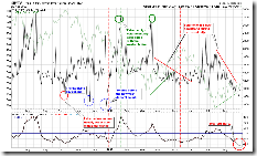
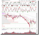
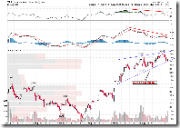
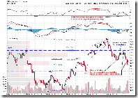
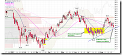
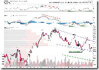
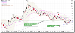
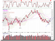
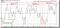
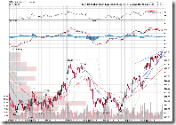
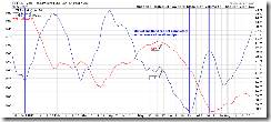
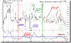
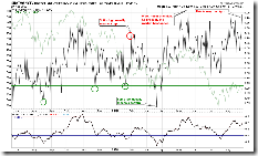
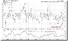
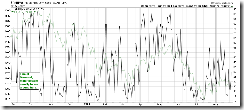
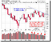
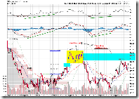
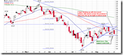
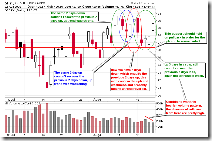
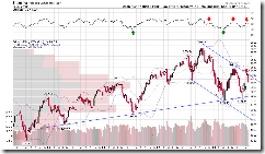
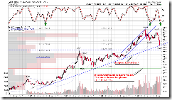
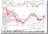
Take a look at this chart: 0.0.5 Weekly STO and the Market Top/Bottom. Think about how the market (denoted by the green line) goes every time when STO gives a sell signal (black line cross downward red line).
This chart says:
- Most likely the market is in the top area instead of bottom area.
- Violent oscillation is one of the market top characteristics, which is also exactly what we saw recently. As indicated as green circles, we cannot rule out the possibility of seeing one or two weeks of sideway or even higher high.
Some people may have many bull market patterns that the market keeps going up for two months after the weekly STO sell signal. Is it possible that the market is at the beginning or middle of two up months?
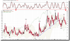
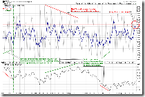
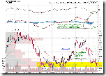
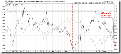
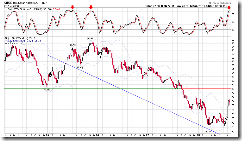
2.0.1 Volatility Index - NYSE (Weekly). Note that STO is at a multiple-year low. The probability of dropping even lower isn't zero but should be quite low.
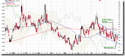
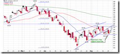
2.0.0 Volatility Index - NYSE (Daily). Weekly chart shows the high possibility of rising VIX, so the pattern in the following chart is very likely a Bullish Falling Wedge.
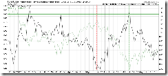
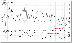
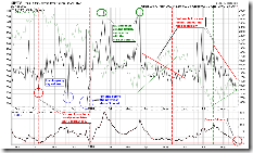
2.0.2 Volatility Index 30-day/90-day Ratio. Don't forget where we are on this chart. I don't think the market has a big upside room.
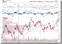
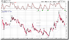
3.1.1 US Dollar Index (Weekly). STO is at a multiple-year new high. US dollar may consolidate at the current level or moderately pull back.
3.1.0 US Dollar Index (Daily). If you trust in the weekly char, you may agree that the Bearish Rising Wedge on the following chart isn't a wishful thinking. Take further notice at the negative divergence of all indicators.
2.8.1 CBOE Options Total Put/Call Ratio. Note the yellow region, normalized CPC is still a bit low which is not good.
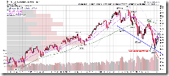
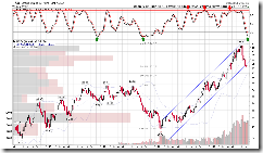
2.3.3 NYSE Total Volume. This is too low. The rally since July 15th is always on a decreasing volume, and I think it is bearish.
Many bulls are arguing that this year is an election year, and republicans won't let the stock market crash. This sounds like the rumored Olympic rally in Chinese market in the past. Concerning this argument, here is a paragraph of August 29th Market Message by John Murphy,
... ... September has been the weakest month of the year since 1950 with an average S&P 500 loss of -0.6. October is also a tricky month. It often starts off weak and ends strong. October has included some of the market's worst declines. The good news, however, is that October has often marked major bottoms... ...
... ... presidential election years are usually up years. Most of those gains come in the second half of the year. The last seven months have seen gains in 13 of the last 14 election years (the only exception being in 2000 when the election results were delayed). That would seem to bode well for this year ending strong. A study of presidential year patterns seems to show two distinct patterns. Several bottoms took place by mid-year (1996, 1988, 1984). Others took place during October (2004 and 1992). That doesn't help us determine whether this year's bottom is behind us or ahead of us. It does mean, however, that odds favor the market ending the year on a stronger note once it gets beyond the dangerous September/October period.
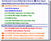
In summary, the market may very close to a mid-term top. A better scenario could be a one to two weeks of sideway and even a higher high. But don't hope too much, we cannot rule out the possibility that we have missed the top. Of course this is just my guess. Always remember that there is no mid-term sell signal on 0.0.0 Signal Watch and Daily Highlights. In term of operation, I will do short-term counter-trend short at high, but still hold mid-term long positions which has been reduced.
What will happen next week? The market won't move on Monday, for sure. What about Tuesday? It's not very clear given some evidence from both bullish and bearish sides. I guess, SPX will drop a bit due to pullback of financials.
Bearish reasons:
5.3.0 Financials Select Sector SPDR (XLF Daily). This is the main reason I guess SPX will drop a bit. XLF has rallied for four days. Besides the mad rally after July 15th, this never happened before.
Take a look at the XLF 15-min chart, bearish rising wedge, MACD and RSI negative divergence. So it should pullback unless there is a really good breaking news on Tuesday causes XLF rally by 3%.
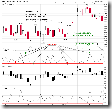
1.0.4 S&P 500 SPDRs (SPY 15 min). This is a typical bearish 1-2-3 format, lower low, and it means that the pullback will continue on Tuesday.
Bullish reasons:
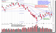
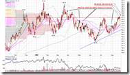
1.1.6 PowerShares QQQ Trust (QQQQ Daily). QQQQ was weak on Friday. But on the daily chart it has pulled back on to a support. The yellow region is a consolidation area and the support should be quite strong. I am not convinced that QQQQ could dive down cross such a strong support region at the first try.
1.1.8 PowerShares QQQ Trust (QQQQ 60 min). Because of bullish falling wedge pattern, the 60-min chart also supports the short-term rebound argument. Of course it doesn't mean QQQQ will bounce back immediately on Tuesday.
1.3.6 Russell 2000 iShares (IWM 15 min). The pattern on IWM looks like a symmetrical triangle. It might go up.
3.2.0 Japanese Yen (Daily). It is testing the important resistance again. The black candle is rather bearish but this is bullish to the stock market. Note that the Japanese Yen is probably forming an Ascending Triangle, and finally break out the resistance and go up. This is consistent with judgement that the US dollar may consolidate or pull back.
Concerning this chart, whether the TA is accurate or my feeling is more reliable: 5.2.3 Energy Select Sector SPDR (XLE 60 min). It surprised me that MACD and RSI negative divergence, and XLE will drop further.
If XLE drops, Canadian market will likely pull back.
1.4.4 TSE McClellan Oscillator. This is the main reason I think the Canadian market will pull back. The black line is too high.
1.4.0 S&P/TSX Composite Index (Daily), overbought, bearish rising wedge.
1.4.3 S&P/TSX Composite Index (15 min). MACD and RSI show negative divergence. By the way, this negative is quite impressive.
