Summary:
Still range bounded.
Market was topped when SPX was at or close to a new high while NYMO was below zero
Black bar on QQQQ daily chart usually means a top is close.
| Trend | Momentum | Comments - Sample for using the trend table. | |
| Long-term | Up | ||
| Intermediate | Up | Neutral | Further confirmation needed for the intermediate-term buy signals. |
| Short-term | Up | Neutral | |
| My Emotion | Wait | Still think this is a bear market rally. |
Bottom line, the market is still range bounded, the direction is unclear. From chart 0.0.3 SPX Intermediate-term Trading Signals, apparently, SPX was stalled under the Rising Wedge resistance. Whether it could breakout is anybody’s guess. My guess is that SPX might pullback from here.
The latest report form Elliott Wave International argues that the market might be topped therefore the wave 3 big fall shall begin. One of its reasons for arguing a top is that the text book target C = A * 0.618 is reached. I don’t see most “wave readers” agree with this call, but I have 2 evidences supporting at least a short-term top is very close - they don’t necessarily predict a big fall though.
7.0.8 SPX and NYMO Divergence Watch, looks like the market was topped whenever SPX was at (or very close to) a new high while McClellan Oscillator was below zero.
1.1.3 QQQQ Short-term Trading Signals, the black bar may mean: 1. Gap down the next day; 2. May very close to a top.
The last but not the least, let me quote the most recent John Murphy’s market message as the end of this report:
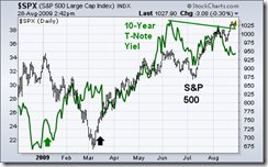
The two up arrows show bond yields turning up three months before stocks in 2009. Both rose together into June when bond yields peaked. The August move to new 2009 highs by stocks, however, hasn't been confirmed by a similar move in bond yields (see falling green line). When two markets are positively correlated, and one of them starts dropping (bond yields), that's usually an early sign that the other one (stocks) may start to drop as well.


